The data source which we will use for our study is the CDC’s National Immunization Survey Adult COVID Module (NIS-ACM). It provides information on COVID-19 vaccination status and intent, segmented by geography, age, ethnicity, socio-economic status, and other characteristics. The data can be found here
2.1.2 How the data was collected and by whom:
The data was collected by the CDC through a series of telephone interviews conducted between April 2021 and June 2023 (latest sample available). Each week, the CDC surveyed between 7,500 to 20,000 US adults aged 18 years and above using a random-digit-dialed sample of cell telephone numbers. These samples were stratified by state, the District of Columbia, and five local jurisdictions (Bexar County, TX; Chicago, IL; Houston, TX; New York City, NY; and Philadelphia County, PA). During some survey periods, Guam, the US Virgin Islands, and Puerto Rico were included as well.
To correct any imbalances or biases in the sample that might arise due to the survey design or data collection methods, the CDC applied weights to the proportion of the sampled individuals giving a particular response in the survey.
2.1.3 Format of the data:
The data is presented as a CSV file in a “pivot longer” format that is downloadable from the CDC’s website provided above. The exact format can be seen without exporting the data using the following link: https://data.cdc.gov/Vaccinations/National-Immunization-Survey-Adult-COVID-Module-NI/udsf-9v7b
The first four columns (Geography Type, Geography, Group Name, and Group Category) are used to characterize the segments of individuals who were surveyed, where any given Geography may contain multiple Group Names and Group Categories. For example, the Geographies “Alabama” and “New York” will each have multiple Group Names, such as “Age by race/ethnicity” or “Pregnancy status (females age 18 – 49 years)”.
The next two columns in the dataset, Indicator Name and Indicator Category, specify the vaccination status/intent variables being analyzed. Each Indicator Name is comprised of several Indicator Categories. For instance, the Indicator Name “Vaccination uptake and intention” has four possible responses such as “Probably or definitely will not get vaccinated” or “Definitely will get vaccinated”.
In addition to the combinations of geographies, participant groups, and survey questions/answers, the data is further subdivided by time period and duration of data collection, which can either be weekly or monthly.
For all the permutations mentioned above, the response rates/proportions and their corresponding confidence intervals and sample sizes are recorded in the columns Estimate (%), 95% CI (%), and Sample Size, respectively.
A complete column-by-column description of all attributes in the dataset is available in the “Columns in This Dataset” section of the page linked below: list https://data.cdc.gov/Vaccinations/National-Immunization-Survey-Adult-COVID-Module-NI/udsf-9v7b
Given that the participant demographics and combinations of survey questions and answers have been pivoted, each “row” of data represents a single observation for each segment/demographic.
2.1.4 Frequency of updates:
The data is updated weekly, with the first samples of data having been collected the week of Apr 22 – May 1 2021 and the latest samples corresponding to the week of June 25 – June 30 2023. The CDC also aggregates its weekly estimates to determine monthly estimates.
2.1.5 Dataset dimensions:
The data contains 5.08M rows x 13 columns.
2.1.6 Other relevant information:
The dataset includes the following additional information, which we will not be studying, as it does not directly address the question of vaccine hesitance: - Vaccination coverage - Bivalent booster update & intention
2.1.7 Potential issues/concerns with the data:
Through data exploration and reviews of the data source documentation, we identified the following potential concerns:
All responses are self-reported & random dialed, making the data quality susceptible to misreporting by respondents.
Due to the random sampling performed, the individuals being interviewed will differ from one period of time to another. While this limits our ability to track changes in perspective from the same people over time, it is likely not going to be an issue since we are concerned with population level statistics rather than individual statistics.
The sample size in the dataset varies by demographic subgroup. Ideally, it would be stratified, but this is likely not possible due to the random-dialed survey design (i.e. the CDC cannot target phone calls to specific demographics). This is likely accounted for by the CDC’s estimate weighting technique.
There appear to be rounding errors in the response rate estimates. For any given combination of geography, participant group, question, and time period, the sum of proportions do not exactly equal 100%. This is due to the response rates in the Estimate (%) column being rounded to just one decimal point. As a result, some sub-samples sum up to 101% across all the response options specified in the Indicator Category.
The data contains NAs in the Estimate (%) column. According to the data source documentations, NAs should only be present in smaller sub-samples (<30) for which the data was intentionally suppressed. However, our data exploration revealed that groups with larger sample sizes, even surpassing 10,000, contained NAs in the Estimate (%) column. Conversely, some groups with samples less than 30 do not have NA response rate values. A related concern is that the Suppression Flag (1 = suppressed) should only be set to 1 where sample sizes were smaller than 30; however, we see Suppression values of 1 for groups of larger sizes. In some instances, the Estimate (%) may not be NA, yet the Suppression Flag was still set to 1.
2.1.8 How to import the data:
Select Download Data Table from the link provided at the beginning of the technical description.
On the following page, select Export from the top right corner next to the Actions button.
Keep the default Export Format as CSV and click Download.
Once downloaded, import the dataset into RStudio for analysis. The function fread() from the data.table library is recommended to reduce load time.
2.2 Research plan
2.2.1 How the data can be used for our research:
The dataset chosen provides a number of interesting factors to be examined in the context of vaccine hesitance. Below, we have outlined the fields we plan to leverage in order to explore potential relationships between our dependent variable - vaccine hesitance response rates - and various independent variables such as geography, age, and ethnicity.
Dependent Variable(s)
The data contains the following dependent variables of interest to our study, which can be identified by filtering our starting-point table for Indicator Name = “Vaccine uptake and intention”:
Estimate (%) (i.e., response rate) for Indicator Category = “Probably or definitely will not get vaccinated”
Estimate (%) for Indicator Category = “Probably will not get vaccinated or unsure”
Estimate (%) for Indicator Category = “Definitely will get vaccinated”
Estimate (%) for Indicator Category = “Vaccinated (>=1 dose)”
For analysis purposes, we combined the vaccine uptake/intention responses into two categories, Hesitant and Not Hesitant, as outlined below. Our focus is to explore factors that relate to Hesitant responses.
Hesitant: Indicator Category = “Probably or definitely will not get vaccinated”
Not hesitant or unsure: all other values in the ‘Indicator Category’
Independent variables
The disparities in vaccine hesitance will be studied initially by geography (as defined by the “Geography” column in our dataset) and then by population segment (specified in the “Group Name” and “Group Category” columns) on a case by case basis. Below are examples of population characteristics we will be analyzing while looking for drivers of vaccine hesitance:
General Demographics:
Gender
Age
Race
Age & race
Sexual orientation
Gender identity
Rural/urban
Birth
Interview language
Poverty
Insurance
Social vulnerability index (SVI)
Political leaning
Health Condition-Specific
Previous vaccination status
Comorbidity
Disability
Pregnancy
Past covid-19 contraction
Reaction to previous dose of vaccine
“Thinking & feeling”
Concern about getting disease
Vaccine safety concerns
“Importance” of vaccine
Social Pressure-Related Demographics
Recommended by healthcare providers
Family & friends’ vaccination status
Employer vaccine mandate
Logistics
Difficulty in accessing vaccine (general “difficulty”, distance to site, convenience, uncertainty about eligibility, cost, difficulty in getting an appointment)
Time window
We would like to study changes in hesitance at particular points in time and changes over a large period of time (2 years, from Apr/May 2021 to Jun 2023). As such, we we will use the Time Period field as another variable for this analysis. While the data is broken down between weekly and monthly samples, we will be focusing on monthly data for our study. This is because we do not expect significant changes in hesitance on a weekly basis, and attempting to compare weekly data could be subject to sampling error due to the random-dialed study design.
2.2.2 Approach:
Our analysis approach can be broken down into the following key activities:
2.2.2.1 Part 1: Study which segments of the population exhibited greatest covid vaccine hesitancy following the deployment of mass vaccinations in the US in early 2021.
This process will consist of the following steps:
Visualizing geographic disparities in vaccine hesitance via spatial heatmaps.
Performing Chi-Square tests to identify the types of population demographics that have an association with vaccine hesitance.
Developing supporting graphs that enable us to explore how vaccine hesitance varies by population segment and draw additional insights. For this step, we will leverage a variety of graph types such as parallel coordinates plots, bar charts, mosaic plots, and scatterplots.
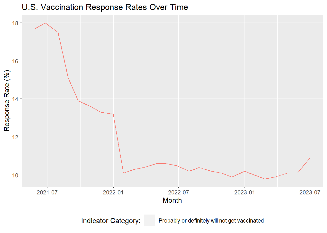
The snapshot in time we will be using to analyze hesitancy will comprise of the first three monthly periods of data available, where the average proportion of responses corresponding to vaccine hesitance was ~18%. To combine the three monthly periods, we will create a weighted average of the survey responses. For instance, if vaccine hesitance rates for a particular group were 20 out 100 (20%) in month 1, 20/150 (13%) in month 2, and 10/90 (11%) in month 3, the weighted average hesitance rate for that group would be 50/340 (14.7%).
The rationale for choosing the first three monthly periods of data is due to the prevalence and relative stability of hesitance during that time frame. Below, we will visualize vaccine hesitance over time to illustrate this.
Code
#Plot vaccine hesitance over time# Import libraries# install.packages("data.table")library(tidyverse)library(data.table)library(lubridate)# Load datasetcovid <-fread("../covid_dataset/covid.csv")# Filter for the vaccination uptake and intent indicator# Filter for responses corresponding to vaccine hesitancy# Include all adults 18+# Set time period to monthly (excluding weekly samples) and filter for nationwide samplesvacc_intention_time <- covid |>filter(`Indicator Name`=='Vaccination uptake and intention') |>filter(`Indicator Category`=='Probably or definitely will not get vaccinated') |>filter(`Group Name`=='All adults 18+') |>filter(`Time Type`=='Monthly') |>filter(Geography =='National') |>arrange(`Geography Type`, Geography, `Time Period`)# Derive month of data collectionvacc_intention_time <- vacc_intention_time |>mutate(month_split =paste0(str_split(`Time Period`, "-",simplify =TRUE)[, 2],", ", Year),month =mdy(month_split))# Plot hesitancy over timeggplot(vacc_intention_time, aes(x = month, y =`Estimate (%)`,color =`Indicator Category`)) +geom_line() +labs(title ="U.S. Vaccination Response Rates Over Time",x ="Month",y ="Response Rate (%)") +theme(legend.position ="bottom") +guides(color =guide_legend(title ="Indicator Category:"))
2.2.2.2 Part 2: Analyze which segments showed the greatest reduction in covid vaccine hesitancy between 2021 and 2023
Following Part 1, will research which segments showed the greatest reduction in COVID vaccine hesitancy between 2021 and 2023. To perform this step, we will leverage several visuals that can provide insights into trends of hesitancy over time:
Cleveland dot plots
Spatial heatmaps
Bar charts
2.2.2.3 Part 3: Based on the findings above, we will propose high-level recommendations for segments of the population that need further public health interventions.
2.3 Missing value analysis
Before moving forward with our analysis approach, we conducted an investigation into possible missing data in our dataset. Our exploration of NAs in the dataset revealed the following findings:
Our dataset does contain NAs; however, they are isolated to the Estimate (%) column in our dataset, as shown below.
Code
# Flag whether a data point is NAmissing_vals_matrix <-is.na(as.data.frame(covid))# Count NAs per columnmissing_col_count <-colSums(missing_vals_matrix)# Create a data frame with column names and NA countsmissing_vals_count_df <-data.frame(Column =names(missing_col_count),NA_Count = missing_col_count)# Plot NA counts per column# All NAs are in the Estimate (%) columnggplot(missing_vals_count_df,aes(x = NA_Count, y =reorder(Column, NA_Count))) +geom_bar(stat ="identity", fill ="cornflowerblue") +labs(title ="Missing Values by Column",x ="Count of NAs",y ="Dataset Attributes") +theme_bw()
Rows of data that have an NA hesitance rate still show the confidence interval for the true hesitance rate. The confidence intervals across these rows show hesitance rates close to 0%, suggesting that the NAs we are seeing should correspond to a hesitance rate of 0%.
Code
# To understand the NAs further, we made 3 observations which strongly indicates NA are in fact zero:# Observation 1: All NAs have a valid 95% confidence interval of between 0-0 to 0-0.3.covid |>filter(is.na(`Estimate (%)`)) |>ggplot(aes(x =`95% CI (%)`)) +geom_bar(aes(y = (..count..)/sum(..count..)), color ="black", fill ="orange") +labs(title ="Confidence Intervals (CI) for NA Values",x ="95% CI for NA Values",y ="Proportion of Total NA Values") +theme(axis.text.x =element_text(angle =0, vjust =0.5, hjust=0.5))+scale_y_continuous(labels = scales::percent)
This is further supported by another finding: there are 0 rows in the entire dataset showing a true 0% response rate. The lowest values that can be seen are 0.1%.
Code
# To understand the NAs further, we made 3 observations which strongly indicates NA are in fact zero:# Observation 2: Estimate (%) is rounded to 1 decimal point, and the lowest possible non-NA value is 0.1covid |>group_by(`Estimate (%)`) |>summarize(count =n()) |>filter(`Estimate (%)`<=0.2|is.na(`Estimate (%)`)) |>arrange(desc(`Estimate (%)`))
# A tibble: 3 × 2
  `Estimate (%)` count
           <dbl> <int>
1            0.2 25242
2            0.1 30264
3           NA   31788
Moreover, within each group and indicator containing at least one NA, the sum of response rates across the non-NA values adds up to 100%. Below is an example of vaccine uptake/intention response rates for individuals 65-years old or older in Wisconsin, sampled between April and May of 2021.
Code
# To understand the NAs further, we made 3 observations which strongly indicates NA are in fact zero:# Observation 3: Sense checks on subsets of the data where NAs are present are coherent, with a valid sample size, and the non-NA Estimate (%) summing up to 100NA_is_zero_proof1 <- covid |>filter(Geography =="Wisconsin", `Time Period`=="April 22 - May 29", Year ==2021, `Group Name`=="Age",`Indicator Name`=="Vaccination uptake and intention",`Group Category`=="65+ years") |>select(`Group Category`,`Indicator Category`,`Estimate (%)`,`Sample Size`,`95% CI (%)`)print(NA_is_zero_proof1)
   Group Category                             Indicator Category Estimate (%)
1:      65+ years     Probably will get vaccinated or are unsure          4.9
2:      65+ years                          Vaccinated (>=1 dose)         88.4
3:      65+ years Probably or definitely will not get vaccinated          6.8
4:      65+ years                 Definitely will get vaccinated           NA
   Sample Size  95% CI (%)
1:         300   1.5 - 8.3
2:         300 83.5 - 93.2
3:         300  3.0 - 10.5
4:         300   0.0 - 0.0
Based on the findings above, we can safely conclude that the NAs in our dataset represent true 0% response rates. As such, we will impute NAs with 0s for our analysis purposes.